ShopDreamUp AI ArtDreamUp
Deviation Actions


Comments46
Join the community to add your comment. Already a deviant? Log In
Ohh ninnzy, your colors are wonderful as usual. The soft pastel work always draws me in when it pops up in my news feed. I especially like the concept portrayed here.
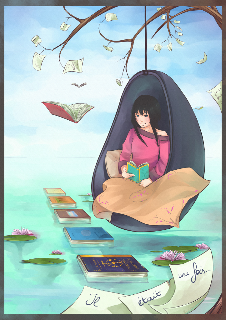
Starting off with what could use some work is perspective. The lily pads are drawn from a low horizon line, as if we were sitting down at the water level and looking up to the girl, except the books are countering this by matching a higher horizon line, along with the girl. Trees are organic, so you can get away with that, but for objects or focal points in a picture, maintaining their perspective is crucial in keeping the viewer looking at the intended spot on the canvas.
Her pose is very stiff, and her eyes aren't really looking anywhere. If you were to take some pillows and a book before sitting in an armchair, or a couch, and mimicked her position, you'd find it very difficult to rest your arms like that while still being able to read what's on the page. Very few people hold books up like that when reading, unless they're slouching in class and have it propped up on the table. I myself enjoy being lazy when reading, so maybe adding more cushioning behind her to support her pose, and drawing the full body, regardless of if everything is seen or not, will help you place other things. I'm not entirely sure how her legs are fitting, since I imagine her knees would be resting up higher on the sides near her elbows.
The blanket doesn't seem to be a full size blanket, or proportionally correct. I can understand you want it "flying off" in the wind, but right now it looks like you're just using it to hide her lack of legs. Like before, if her knees were up on the sides, you could have had it tucked under one of her legs, so as to keep it from blowing away, which would create more weight in the drawing and make it more believable.
Rule of threes would help splendidly in several places.You've almost got it with the lily pads on the left, though I'd suggest making the lone one a little smaller to be the medium size. As you probably know, rule of threes regards to three of the same objects of different sizes; small, medium, and large, where the small and large are placed nearer to each other while the medium balances out the negative space a little further away. This could also be applied to the papers on the branches of the tree, and the paper in the foreground.
Rule of thirds would be to move her up slightly so her head falls onto the top right intersection of the canvas. This creates for a better composition and focal point. Speaking of focal point, while the colors help draw our attention to the darkness around the girl, the books are sending our eyes off into the horizon. I understand the intent of design behind lying them out like this, but perhaps scattering them via rule of threes would be more appropriate in solidifying your composition.
You keep improving so much with every piece, dear. It really is a treat to see you submitting new things, learning and experimenting as you go. Keep up the good work!